Your Leaflet Design Checklist:
To make your job easier when compiling your leaflet, we’ve outlined these handy tips to help:
1. What is the Aim and Message of your Leaflet?
What is it you want your leaflet to say? Is this immediately obvious from first glance? Keep your message concise and to the point. Ensure that your message is on the top part of your leaflet as this can sometimes be the only part of the leaflet that will be seen when displayed in some sales racks. Draw attention to your headline by keeping it short but eye-catching.
2. Who is your Target Audience?
Know your audience before you begin. Who are they, who do you want them to be and are you targetting them correctly? Make sure your choice of colour, imagery and copy style will appeal to your target audience. Check that your distribution points are appropriate to your audience.
3. Choice of Colour
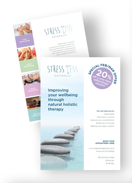
Use colours that attract and complement each other. Do not over use colour as this can be jarring to the eye. Full colour leaflets will always attract the most attention. Use colours that stay true to your branding. See our blog on the importance of colour choice in branding for choosing appropriate colours for your product/service.
4. Strong Imagery
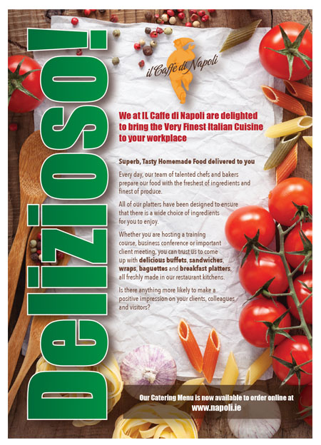
Pictures are a fantastic way to reinforce your message and they should display exactly what you want to sell. Go with big strong imagery rather than multiple, smaller images as they tend to look scrappy and will in turn, dilute your brand and message. Use high quality images that will reproduce well and avoid using images from your website as their resolution will probably be too low for sharp printing.
5. Concise Wording
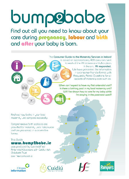
You love your product/service and want to tell everyone all about it but it’s impossible to say everything on one leaflet – so be selective. Your copy needs to be concise and easy to read. Use short headings, short sentences and blocks of text in a typeface that is easy to read. (We recommend no smaller than 9pt) Don’t feel the need to fill all the space in your leaflet with text as this can be confusing to the eye and your reader will quickly lose interest in your topic.
6. Ensuring a Call to Action
Ensure your audience is in no doubt as to what you are asking them to do and make it easy for them to follow through by including your contact details clearly: phone number, email address, website address, business address and opening times. By supplying a contact name – you are making it a more personal experience.
7. Offer Inclusion
Adding offers or vouchers on your leaflet will tend to make your audience hold on to your leaflet for longer and will also help you judge the success of a particular leaflet campaign.
8. Paper Choice – Quality and Size
Use a good quality paper/light card for your leaflet. The size of the leaflet should depend on what you’re using it for and where it’s going to be displayed. Most leaflets tend to be A5 or DL size. Leaflets this size fit in nicely with most distribution racks.
9. Proofing, proofing….. and proofing again
Did we mention proofing? Make sure that there are no bad spellings or bad grammar on your leaflet. This shows a lack of care and attention. Catch your mistakes early and fix them, before they become expensive mistakes.
So that’s the list. We hope it makes your job easier when compiling your leaflet and in turn, ensures that you get the most out of your investment. But remember, if you need any help we are always here and would be more than happy to answer any questions you may have.


